SwiftUI
What minimumScaleFactor trades away in SwiftUI
I ran into a typography inconsistency in a production SwiftUI interface, then reduced it to a reproducible case to understand what minimumScaleFactor was trading away.
8 min read
Audio edition is being recorded
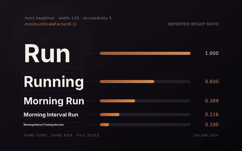
I ran into this in a production SwiftUI interface.
Several adjacent labels were supposed to belong to the same typography system. They used the same .headline, the same layout constraints, and the same Dynamic Type environment.
But once minimumScaleFactor was involved, they no longer looked like one typography system.
The obvious explanation was that every Text was solving fitting independently.
That explanation made sense, but I did not want to stop at "that seems plausible."
So I reduced the production case to ordinary SwiftUI first.
No custom Layout. No measurement harness. No GeometryReader.
Consider this shape of UI:
VStack(alignment: .leading, spacing: 12) {
    Text("Run")
        .frame(width: 120, alignment: .leading)

    Text("Running")
        .frame(width: 120, alignment: .leading)

    Text("Morning Run")
        .frame(width: 120, alignment: .leading)

    Text("Morning Interval Run")
        .frame(width: 120, alignment: .leading)

    Text("Morning Interval Training Session")
        .frame(width: 120, alignment: .leading)
}
.font(.headline)
.lineLimit(1)
.minimumScaleFactor(0.1)
Every label declares the same .headline. Every label gets the same width. Every label gets the same fitting policy.
But those declarations do not guarantee one visual text size once fitting starts happening independently.
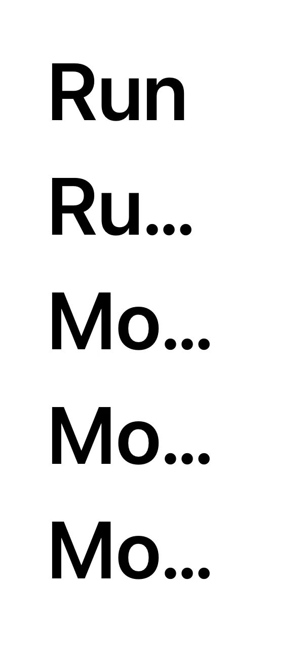
No scaling
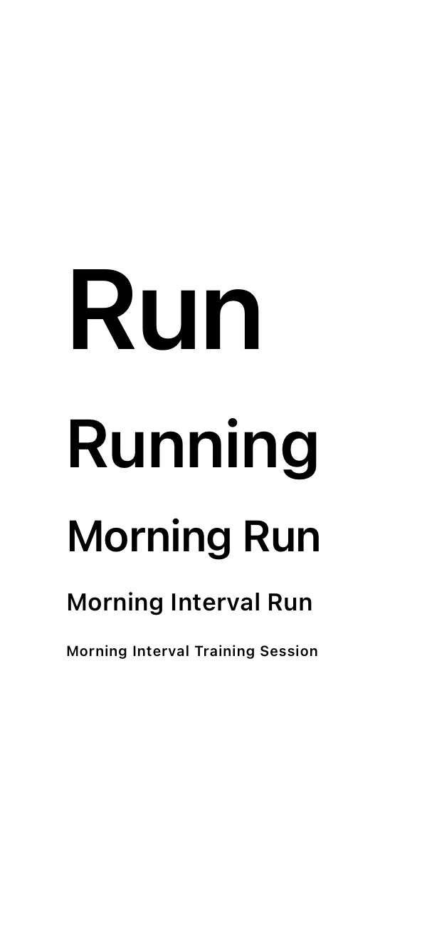
minimumScaleFactor(0.1)
Layout, no GeometryReader. Accessibility 5 set in the simulator, width 120, iPhone 17 on iOS 26.5.Run remains large. The longest string becomes dramatically smaller. Without scaling, the same labels truncate instead.
That is not evidence that SwiftUI is broken. It is consistent with what the modifier is designed to do.
The part worth paying attention to is the design consequence:
A shared typography token can stop producing shared visual typography when every label is allowed to solve fitting independently.
The production symptom reproduced without any measurement code.
That mattered: the custom layout harness was not creating the behaviour.
Once I had that control, I wanted to know how systematic the effect was, so I instrumented it.
What minimumScaleFactor actually promises
Apple describes minimumScaleFactor(_:) as the minimum amount that text can scale down to fit available space.
The important word is minimum.
This:
.minimumScaleFactor(0.8)does not mean "render at 80%".
It means SwiftUI may reduce the text as needed, but the modifier does not permit the scaling to go below that floor.
That distinction becomes useful later.
It also means that different strings can make different fitting decisions. A short string might need no reduction at all. A longer string in the same width might need most of the permitted reduction.
That behavior is expected.
The question for a UI engineer is what that does to a group of labels that were supposed to share one typographic hierarchy.
I instrumented the layout instead of guessing
Once the production behaviour reproduced in plain SwiftUI, I built a small research project around the public Layout API. The measurement harness observes the behaviour; it does not create it.
The first experiment varied:
| Variable | Values |
|---|---|
| Container width | 200, 160, 120, 100, 80 pt |
minimumScaleFactor | none, 0.8, 0.5, 0.1 |
| Dynamic Type | large, xxxLarge, accessibility1, accessibility3, accessibility5 |
| Labels per condition | 5 |
That produced 100 conditions and 500 validated measurement rows.
The five strings were:
Run
Running
Morning Run
Morning Interval Run
Morning Interval Training Session
The project records the size proposal received by the layout, the proposal sent to Text, responses to several public ProposedViewSize requests, and the final size reported by the child.
Apple documents this proposal-response model directly: a parent proposes a size, and a view chooses a size in response. For custom layouts, .zero, .infinity, and .unspecified can also be used to ask for minimum, maximum, and ideal responses.
The raw project, CSV files, screenshots, and reproduction material are public: swiftui-text-scaling-lab on GitHub.
The result is systematic, not mysterious
Across the 25 conditions where no scaling was enabled, 0 of 25 had different measured heights among the five adjacent labels.
Across the 75 conditions where scaling was enabled, 75 of 75 had different measured heights among the five labels.
| Minimum scale | Conditions | Heights differ | Lowest ratio |
|---|---|---|---|
| none | 25 | 0 | 1.000 |
| 0.8 | 25 | 25 | 0.799 |
| 0.5 | 25 | 25 | 0.500 |
| 0.1 | 25 | 25 | 0.099 |
Lowest ratio is the smallest reportedHeightRatio observed in that group, defined below.
This is not the discovery that "longer strings shrink more".
That would just restate the modifier.
The useful part is that the local fitting decision was systematic enough to break the visual uniformity of a group even though all five labels declared the same typography and lived under the same geometry and Dynamic Type condition.
If those five labels are independent bits of content, that might be fine.
If they are tabs, filters, adjacent navigation items, compact status labels, or another component where typography is part of the shared hierarchy, it might not be fine at all.
Visual evidence and layout evidence are not the same thing
There is an important limitation in this experiment.
The screenshots show the visual result.
The layout probe records the sizes that Text reports.
Those are related observations, but they are not the same measurement.
For analysis I use:
reportedHeightRatio = measuredHeight / idealHeightThat ratio is useful for seeing how the reported layout response changes under constraint.
It is not SwiftUI's internal glyph scale.
The public APIs used here do not expose that internal value, so I do not claim to know it.
This distinction matters because it would be easy to look at a dramatic screenshot, divide two heights, and call the result "font scale". That would be a stronger claim than the API supports.
A lower floor buys fitting room by spending typography
The screenshots make the trade-off easier to see than a number does.
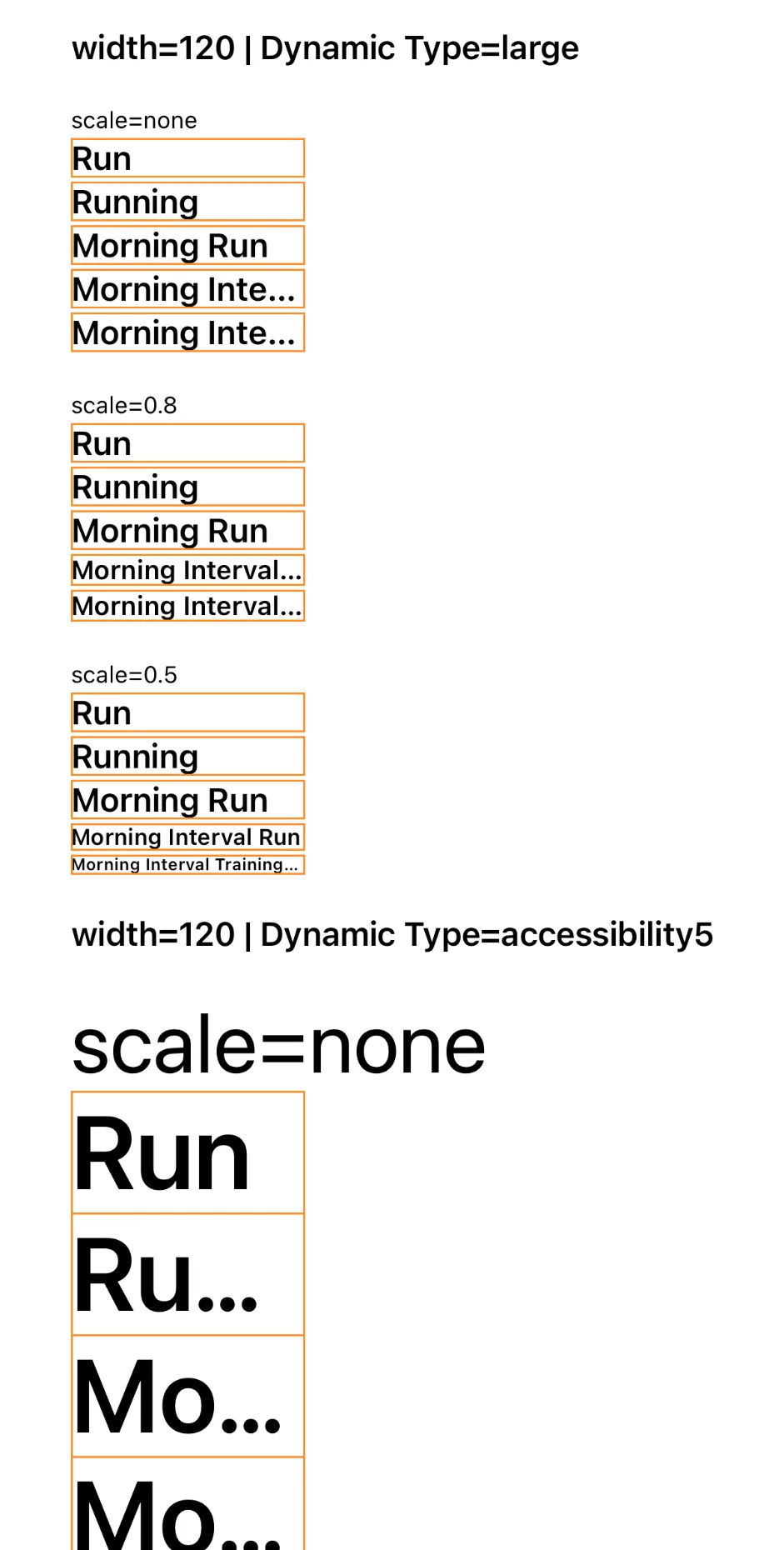
With no scaling, typography stays visually stable but long single-line content can truncate.
With a relatively high floor such as 0.8, SwiftUI gets some room to fit, while preserving more of the original text size. Some strings can still run out of room.
With a much lower floor such as 0.1, SwiftUI gets far more room to preserve content inside the same box. The cost is that adjacent labels can become visually very different from each other.
There is no universally correct value.
The modifier is choosing between competing constraints, not removing them.
The minimum is a floor, not a target
The second experiment isolates one string:
Morning Interval Training SessionAt .large, the measured ideal width in this environment was approximately 264.33 pt.
I then measured the same string at several container widths with:
.minimumScaleFactor(0.8)Here is the corrected width sweep:
| Container width | Measured height | Ideal height | reportedHeightRatio |
|---|---|---|---|
| 200 pt | 16.33 pt | 20.33 pt | 0.803 |
| 240 pt | 18.00 pt | 20.33 pt | 0.885 |
| 250 pt | 19.00 pt | 20.33 pt | 0.934 |
| 260 pt | 20.00 pt | 20.33 pt | 0.984 |
| 264 pt | 20.00 pt | 20.33 pt | 0.984 |
| 270 pt | 20.33 pt | 20.33 pt | 1.000 |
| 280 pt | 20.33 pt | 20.33 pt | 1.000 |
| 400 pt | 20.33 pt | 20.33 pt | 1.000 |
| 800 pt | 20.33 pt | 20.33 pt | 1.000 |
The point is not that 270 pt is a magic SwiftUI threshold.
It is not.
The ideal width itself is about 264.33 pt, so the return to the ideal reported height in that neighborhood is exactly where you would expect fitting pressure to disappear.
What the sweep demonstrates is simpler and more useful:
minimumScaleFactor(0.8) is a lower bound, not a request to render everything at 80%.At 200 pt the reported height is close to that floor. As the container gets wider, the reported response approaches the ideal value. Once enough space is available, the ratio returns to 1.0.
Two frames from the same corrected experiment show the practical difference:
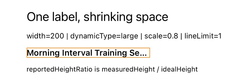
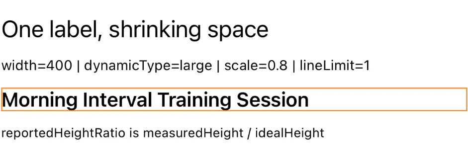
The 800 pt measurement remains useful as a control, but I do not use its phone screenshot here because the test container extends beyond the viewport.
Dynamic Type makes the design conflict easier to see
The same issue becomes more obvious at accessibility sizes because the requested text starts larger while the component still has the same finite horizontal space.
That does not mean minimumScaleFactor is inherently inaccessible.
This experiment is not a complete accessibility audit, and it cannot establish that every use of the modifier harms accessibility.
It supports a narrower claim:
In a constrained single-line component, allowing each label to scale independently can substantially reduce the size that Text reports even when the subtree receives an accessibility Dynamic Type value.The visual result can be severe when the floor is low.
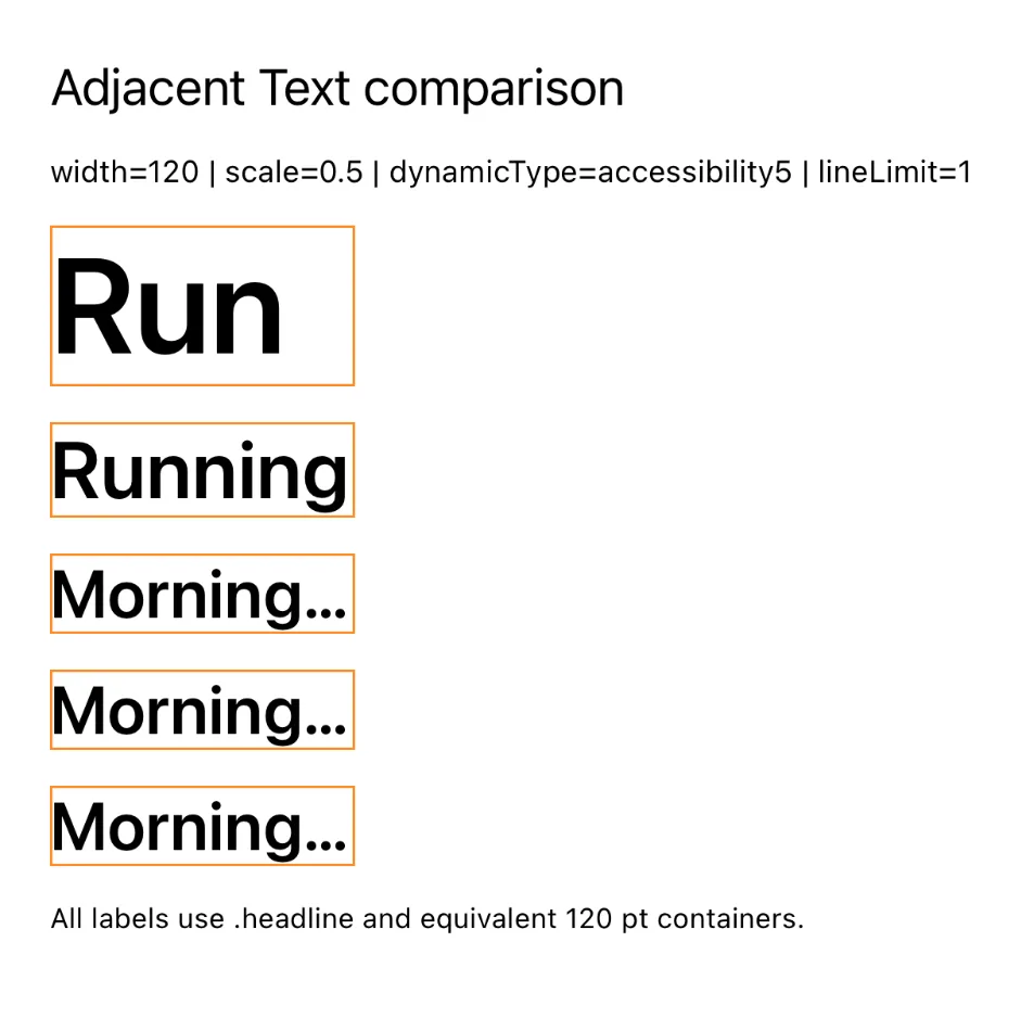
minimumScaleFactor(0.5), instrumented run.The user is asking the system for larger text.
The component is also asking SwiftUI to keep that text inside a fixed single-line box.
Those constraints can pull in opposite directions.
That should be an explicit product and layout decision, not an accidental side effect of adding a modifier.
Truncation is a visual observation here
Some screenshots show longer labels truncating at higher minimum factors.
I deliberately do not infer truncation from reportedHeightRatio or from ideal width alone.
The public layout measurements tell me what sizes were proposed and reported. They do not expose a public boolean that says "this exact rendered string truncated" in this harness.
So in this project:
- scaling-related layout responses are measured;
- truncation is treated as a screenshot-level observation;
- internal line-breaking and glyph-scaling decisions remain unknown.
That separation is important because the article is about the trade-off, not about pretending the public API reveals SwiftUI's private text engine.
I also invalidated one of my own runs
The first width-threshold experiment was wrong.
The custom layout reused its incoming parent proposal directly. In that context the parent supplied a height of 0.
So instead of isolating horizontal pressure, I accidentally measured the label under both a constrained width and an artificial zero-height proposal.
The suspicious symptom was useful: even very wide containers appeared to push the reported height toward the configured minimum.
I rejected that run.
The corrected experiment sends the child:
ProposedViewSize(
    width: containerWidth,
    height: nil
)
The original incoming proposal is still recorded as diagnostic metadata, but it no longer drives the width-only measurement.
The corrected sanity check behaves as expected. At .large / 0.8:
- 200 pt reports 16.33 pt versus an ideal height of 20.33 pt;
- 264 pt reports 20.00 pt;
- 280, 400, and 800 pt report the full 20.33 pt ideal height.
The rejected run is preserved in the public repository rather than silently deleted.
That is not part of the SwiftUI finding. It is part of making the experiment auditable.
What I would do in production
This investigation started because the visual hierarchy in a real production component looked wrong even though the labels declared the same typography.
I still use minimumScaleFactor.
What changed is what I expect from it.
When adjacent labels are supposed to share a clear visual hierarchy, I now ask what I am willing to trade away:
- Can the component grow horizontally?
- Can the text wrap?
- Is truncation actually worse than inconsistent typography?
- Are these labels supposed to look like one type system?
- What happens at accessibility Dynamic Type sizes?
- Is a very low minimum scale preserving content at the cost of making that content harder to read?
Sometimes independent scaling is the right answer.
Sometimes multiline text is better.
Sometimes the component needs more room.
Sometimes truncation is the least bad compromise.
The important point is that these choices are not equivalent.
What this experiment does not prove
The project does not tell me:
- SwiftUI's exact internal glyph scale;
- the private line-breaking algorithm;
- the internal rendering decision sequence;
- that every use of
minimumScaleFactorcreates an accessibility problem; - that the observed behavior is a SwiftUI framework bug.
The tested environment was:
| Environment | Value |
|---|---|
| Xcode | 26.6 (17F113) |
| Swift | 6.3.3 |
| iOS Simulator SDK | 26.5 |
| Deployment target | iOS 17.0 |
| Simulator | iPhone 17 |
| Simulator OS | iOS 26.5 |
The conclusions should be read at that level of precision.
Reproduce it
The complete research repository is public: swiftui-text-scaling-lab on GitHub. It contains the Xcode project, validated measurements, screenshots, corrected threshold evidence, and the preserved failed run.
The two final datasets used in this article contain:
- 500 rows and 100 conditions for the adjacent-label experiment;
- 220 rows and 220 conditions for the corrected width-threshold dataset.
If you reproduce the experiment on another OS version, device, font, or string set, I would expect the exact numbers to move.
The design question does not depend on those exact numbers.
font(.headline) tells SwiftUI which typography I want.
minimumScaleFactor tells it how much of that typography I am willing to trade away when a particular label does not fit.
The production issue came from treating those as if they were the same decision.
References
- Apple, minimumScaleFactor(_:)
- Apple, ProposedViewSize
- Apple, LayoutSubview
- Apple, dynamicTypeSize
- Reproduction repository: salari-dev/swiftui-text-scaling-lab